Navigating Dashboards
Note: This section details the navigation functionality that differs for some HHAX Dashboards (created and released after December 2022). For details and instructions for classic dashboards, refer to the Navigating Classic Dashboards section.
This navigation functionality applies to the following dashboards:
-
EVV Management
-
Billing
-
Authorizations
The Dashboard Homepage
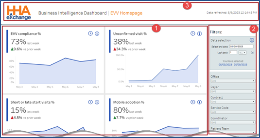
The following image illustrates the EVV Homepage dashboard, accessed from the main Dashboard homepage (used to demonstrate the navigation in the updated platform). This dashboard is comprised of cards (1), presenting high-level informational widgets or charts in the main panel. The filters (2) on the right side of the page are used to generate information on the charts. The top of the page indicates the Dashboard name and a date and time stamp showing the last data refresh (3).
EVV Home Dashboard
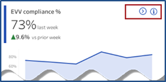
Each card provides a set of functions allowing users to access specific information within the widget (on the top-right corner), as seen in the image below.
EVV Widget: Widget Functions
Click or hover over the Information icon (![]() ) to view the tool tip providing details on the displayed figure and how the figure is calculated, as seen in the image below.
) to view the tool tip providing details on the displayed figure and how the figure is calculated, as seen in the image below.

Widget Tooltip
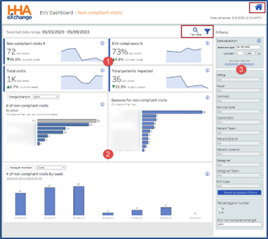
Click on the Navigation icon (![]() ) to access the details for this specific card. In this example, the Non-Compliant Visits dashboard opens. Similar to the home layout, this dashboard also contains cards with high-level KPIs (1), interactive widgets (2) allowing users to customize (Change Dimension, Add Payers to) the particular chart rather than changing all displayed charts and filters (3), used to generate specific data across all cards and widgets for this dashboard.
) to access the details for this specific card. In this example, the Non-Compliant Visits dashboard opens. Similar to the home layout, this dashboard also contains cards with high-level KPIs (1), interactive widgets (2) allowing users to customize (Change Dimension, Add Payers to) the particular chart rather than changing all displayed charts and filters (3), used to generate specific data across all cards and widgets for this dashboard.
EVV Non-Compliant Dashboard
Hover over any graph or chart to see calculations for a specific component on a tool tip pop-up, as seen in the following image. In this example, the Timesheet Received topic in this performance graph shows the calculations for the exceptions in the Reasons for Non-Complaint Visits widget.

Tool Tip: Specific Calculations
Click on the View Data magnifying glass icon (![]() ) to view source data for the dashboard. Refer to the View Data section for more details.
) to view source data for the dashboard. Refer to the View Data section for more details.
The filter icon (![]() ) to the right of the View Data icon, is used to hide the filter pane, allowing for more screen space. To display the filters, click on the menu icon (
) to the right of the View Data icon, is used to hide the filter pane, allowing for more screen space. To display the filters, click on the menu icon (![]() ), to the right of the View data icon to revert.
), to the right of the View data icon to revert.
Click on the home icon (![]() ) at the top-right of the page to return to the selected Dashboard Homepage.
) at the top-right of the page to return to the selected Dashboard Homepage.
Filters
The filter pane, on the right side of the screen, is used to select criteria and generate specific data to display on the cards and widgets. The filter pane is comprised of three sections to include the Date/Date Range (1), Data Selection (2), and Data Display (3) preferences.
Filter selections vary by dashboard, depending on the information. For example, a Date Type filter is available in the Billing Dashboard to select if to view data by Invoice or Visit date. Refer to a specific Dashboard for further details.

Dashboard Filters
Dimension Fields
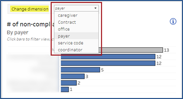
Some widgets have a Change Dimension dropdown field used to select a particular data set (such as by Payer, Caregiver, or Contract) to generate results for that particular card. In the example below, Payer is selected in the # of Non-Compliant Visits widget. The results in this widget are particular to Payers.
Dimension Dropdown Field
Other Dimension fields may be available to add specific Contracts or Payers to generate results. The image below illustrates a selection of Payers using the Add Payer Into Chart dimension field, to apply to the # of Visits Using Mobile App by Week widget.
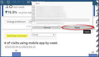
Add Payer Dimension Field
View Data
When clicking on the View Data magnifying glass icon, the system generates the source data in report format, as seen in the following image.
Selection filters are available to modify the information displayed. Below the filters, the results indicate the total number of Non-Compliant Visits (in this example), and a # of rows displayed and downloadable text box is available for users to adjust, as preferred; the default value is set to 1000.
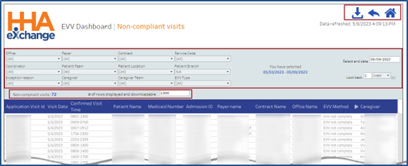
View Data Example
Note: Maximum download limit is 500,000 rows.
Various options are available at the top-right section of the page, as seen in the image above.
• Click the Download icon (![]() ) to export the displayed data in CSV or Excel format.
) to export the displayed data in CSV or Excel format.
• To return to the Dashboard, click on the return icon ![]() (back arrow).
(back arrow).
• To return to the main dashboard, click on the home icon (![]() ) next to the return icon.
) next to the return icon.